Part 7 of a short series on formalizing my consulting business. Part 6: the logo.
A design system sounds like something a company with a design team builds. It isn't. It's a short list of decisions (these colors, this type, this spacing) written down once, so you stop making them again every time you build a page. For a company of one, that matters even more: nobody else is going to catch the drift.
I did mine in one evening, with Claude driving Figma and me making the calls.
Figma or an AI design tool?
My first question was whether to use one of the newer AI design tools instead of Figma. Claude's answer was to keep Figma as the single source of truth. My logo already lives there, and I pay for the seat. Figma "variables" (named colors, sizes and spacing) can also be turned directly into code for the website. The AI design tools are great for quick mockups. They shouldn't be a second copy of your brand.
Pick one place where the brand lives. Everything else gets exported from it.
I still didn't love the logo
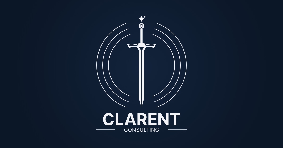
Before any colors, I fixed something that had bugged me for a day. The AI spark above the sword looked off-center and a little too big.
It was off-center. The small companion spark sat to the right of the main one and pulled the whole cluster that way. Claude measured it, then built five versions side by side at full size and at favicon size: drop the companion, shrink it, or keep it and shift the pair so its visual weight sat on the sword's center line.
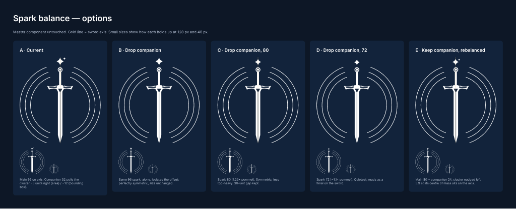
The mathematically balanced option lost. It fixed the balance by moving the main spark off the sword's center line, and my eye caught that immediately. I picked it anyway, looked at it for ten minutes, and changed my mind. The final version: main spark smaller and dead center, companion kept (it's what makes the mark read as AI rather than as a plain four-point star), tucked into the corner above the main spark's right point, and closer to the sword.
Because every lockup is built from one master emblem, the change flowed everywhere at once. Then we restored the original margins so none of the lockups shifted.
Three palettes, with the math shown
The site is dark first, which is a strong preference of mine. Claude built three dark palettes with the same mock hero section in each: deep navy, near-black and navy with ivory type. Under each one it listed the contrast ratios that decide whether text is actually readable.
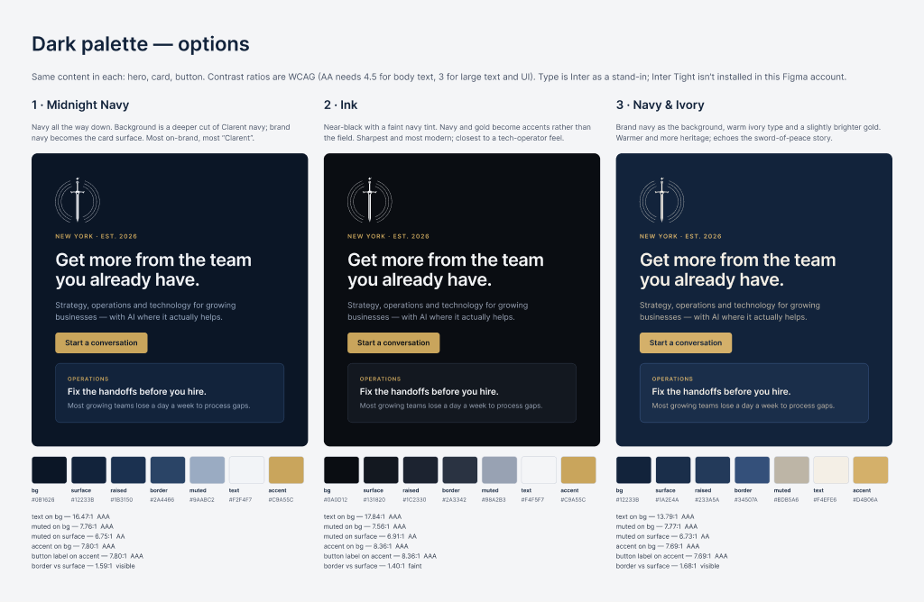
I picked Midnight Navy. Background, cards and text are all shades of the brand navy, with gold as the only accent. Body text comes in at 16.5 to 1; the accessibility standard asks for 4.5.
The part worth copying is how it's set up in Figma:
- Raw colors (navy 950, gold 500) exist but are hidden, so nobody can use them directly.
- Named roles point at them: background, card, text, muted text, accent, border, focus. You design with the roles.
Change a raw color once, and every role that uses it updates across the whole brand.
The font I had to give up
I'd picked Inter Tight the day before. Then we hit a wall: Claude's Figma edits run on Figma's servers, not my laptop, so it can't use a font I install locally. Uploading your own fonts to Figma requires a more expensive plan.
We tried a workaround where I'd flip a setting every time Claude touched text. I asked the obvious question: does it have to be this font? Inter Tight is regular Inter with tighter spacing, and Figma has Inter built in. Claude put six built-in options side by side, and I went with Inter, pulling headings a bit tighter to get the same look. Nothing needed redrawing, because the letter shapes are identical.
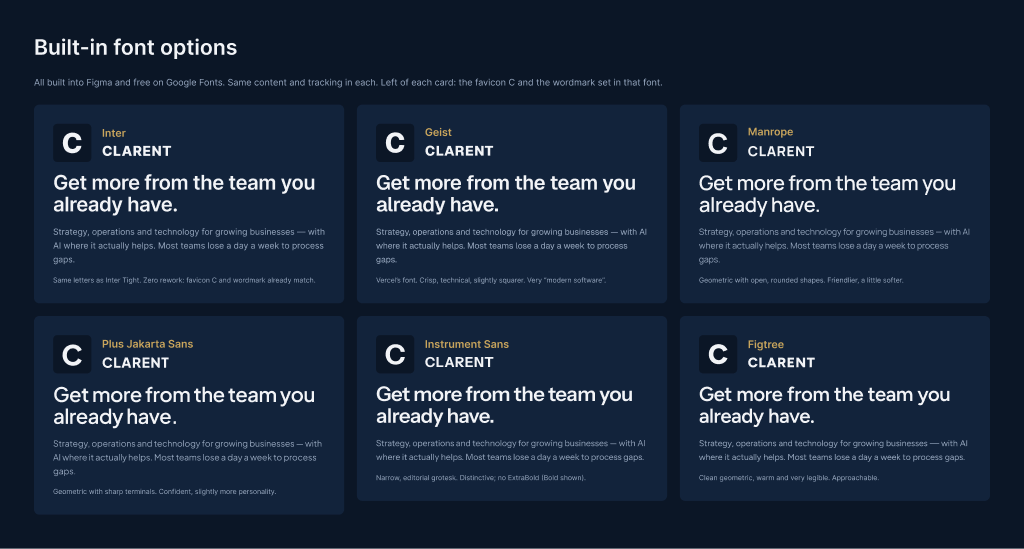
If your tools, including the AI, can't all use it, it's not your font.
From Figma to the live site the same night
Every color, size and spacing value lives in Figma, each with a matching name for code. Claude generated the site's style file directly from those, including smaller heading sizes for phones, so design and code use the same names and can't drift apart.
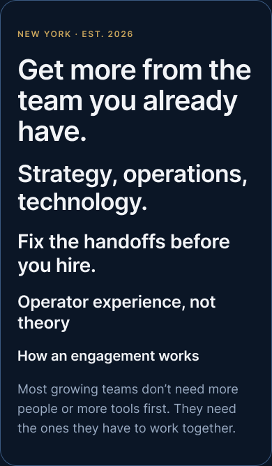
Then we shipped it. The coming-soon page went from warm charcoal to Midnight Navy, got the corrected logo, and got a new link-preview image so the site looks right when someone shares it. It was live before I went to bed.
Every decision went into a running decision log with the reasoning, so I don't argue with myself about the spark again next month.
What I'd tell someone doing this
- Decide the few things first: colors, type, spacing. A system is a short list, not a big project.
- One source of truth. Everything else gets exported from it.
- Named roles over raw colors. "Card background" survives a rebrand; "#12233B" doesn't.
- See options at real sizes, with the numbers. Then trust your eye over the math.
- Pick tools everyone can use, including the AI doing half the work.
- Write down why. Future you will try to relitigate it.
If you're building a brand for your own business and wondering how much "system" you actually need, ask me. I'll tell you what I'd skip. And if you're a designer and something here made you wince, I want to hear it.
Comments
Leave a comment
A Logo, a Favicon, and My First Piece of Collateral — Built in Figma With Claude Driving
The AI-generated emblem was the brief, not the file. Rebuilding it properly taught me more about brand work than the generating did — and the first thing it went on was a golf sign.
I Set Up a CRM Before I Had a Pipeline. Here's Why Attio.
Three real relationships and no revenue isn't a pipeline. I built the system of record anyway — Attio, fed by Granola and Claude — because the first time you need a CRM is exactly when it's too late to set one up.
I Set Up the Books Before There Was Any Revenue. That Was the Point.
No QuickBooks, no bookkeeper, no numbered chart of accounts. A spreadsheet built around Schedule C, a receipts folder that sorts itself, and Claude reconciling against the bank feed.